
The Chart in the dashboard is a useful tool that provides a visual representation of your Jobs. The chart is color coded and separated by different Job Statuses.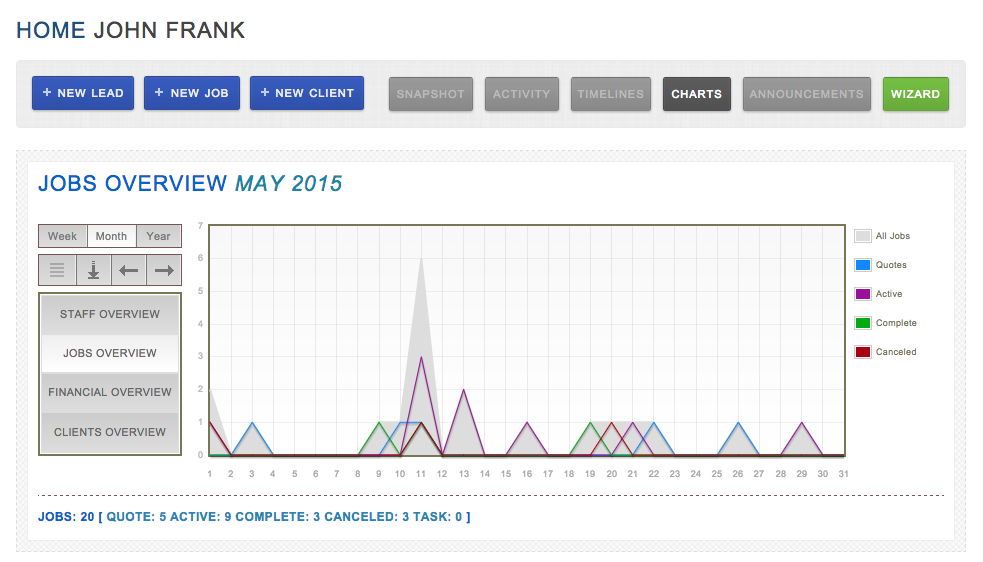
The Chart can be sorted by Staff, Jobs, Finances, and Clients, as well as separated by time periods.